Xbox Mobile App
Consolidating the mobile ecosystem
Design and strategy behind the merging of Xbox's two mobile apps into one, resolving the information architecture challenge of combining two distinct audiences without deprioritizing either. The consolidated app freed up significant engineering capacity and positioned the team to move fast when a new opportunity arose.
Overview
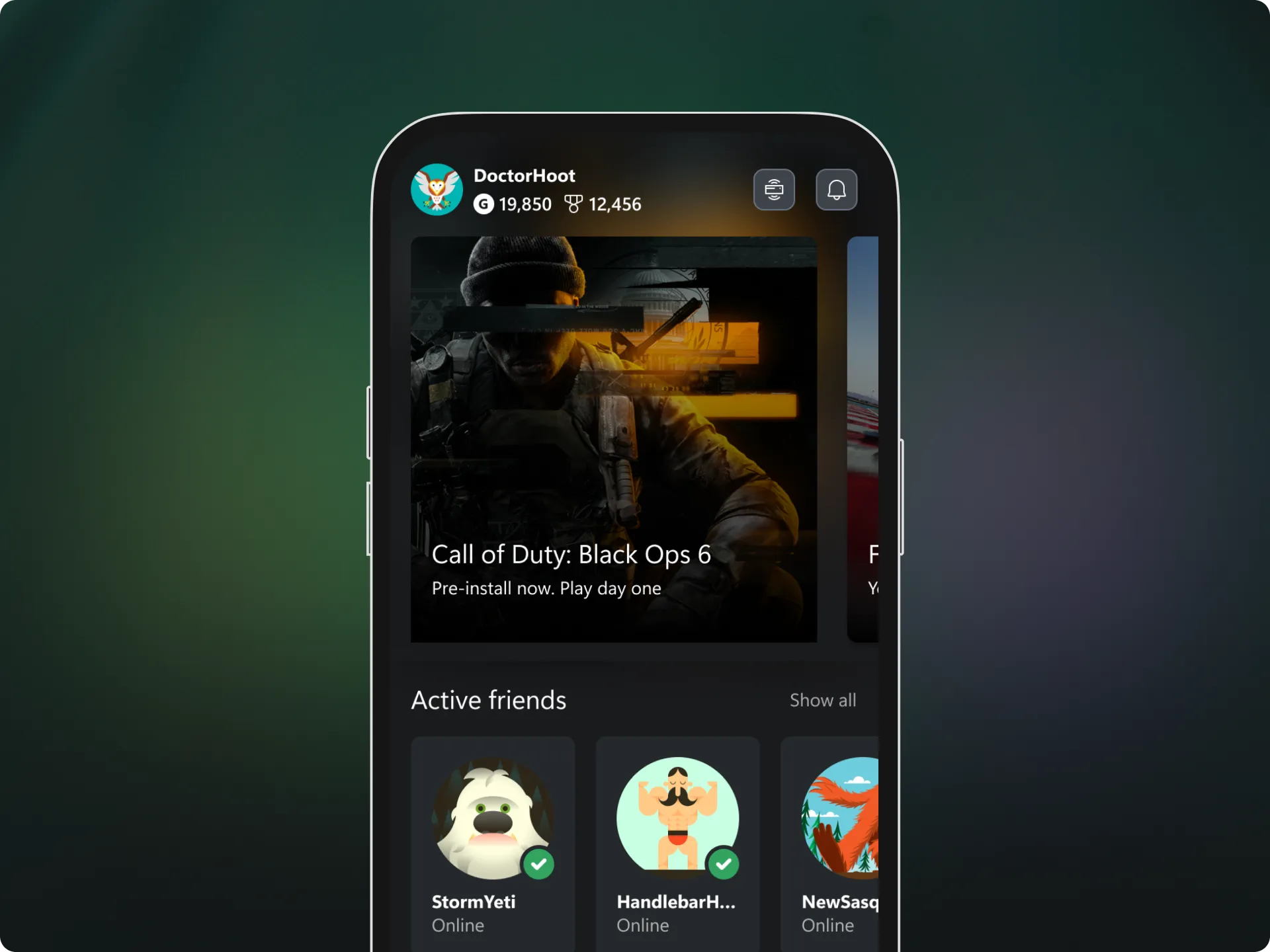
I was the design lead for Xbox's flagship mobile app, responsible for its original release and the ongoing maintenance and improvement that followed. I shipped the app in November 2020, alongside the launch of the Xbox Series S and Series X consoles. The product centered on social engagement and console management, helping new console owners get set up and stay connected to their gaming community wherever they had a phone on hand. Because the team owned the full stack, the app also functioned as an experimentation platform, a place to test functionality ahead of a broader rollout to other devices.
Around the same time, a separate team was building a dedicated Game Pass app. From the start, leadership expected the two experiences would eventually need to consolidate, or that the Game Pass app would need to take a different shape. A dedicated surface made sense against KPIs built around Game Pass subscriber growth, but it made less sense from an overall customer experience standpoint. That tension went unresolved for years, until tighter budgets made maintaining both apps unsustainable and turned the question from hypothetical to immediate.
Problem
Maintaining two separate mobile apps meant two codebases, two release schedules, and two sets of compliance and testing overhead, across every device and app store the team shipped to. The cost and coordination burden compounded every time a new feature needed to ship in both places at once. Complicating things further, each app had its own dedicated team, which meant every decision about shared functionality required coordinating across two organizations with different priorities, not just two codebases. At the same time, the broader mobile strategy was moving away from maintaining unique surfaces per use case, toward a single, unified platform, closer to how consumer apps like Spotify handle multiple use cases inside one responsive experience rather than standing up separate apps.
Consolidating made sense on paper. The hard part was doing it without quietly abandoning either audience.
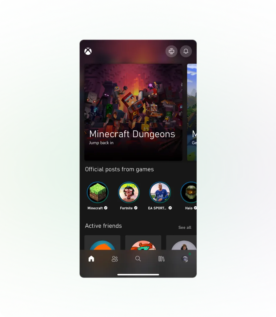
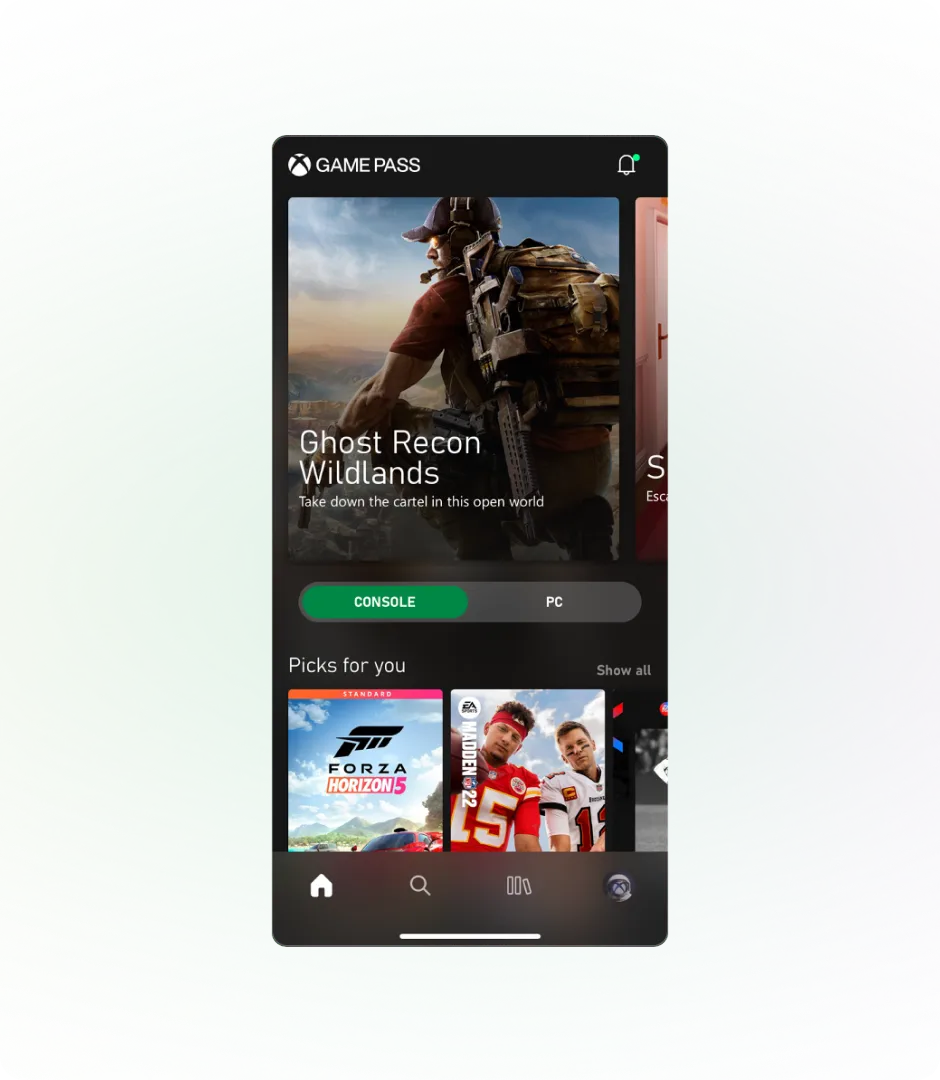
The two apps had real, distinct identities. The flagship app was the broader hub, community, discovery, console management, built for the wider Xbox base. The second app existed specifically to give the subscription catalog constant visibility: browsing, discovery, and management of what was included, built for a smaller but highly engaged subscriber audience.
The flagship app alone served a large, established base of monthly active users, spanning console gamers and highly engaged subscribers alike. There was meaningful overlap between the two audiences, but the use cases were different enough that a naive merge risked burying one experience inside the other.
Customers felt the friction directly. As one player put it in a public app store review:
I'm not a fan of flipping between my Xbox app…and the "Game Pass" app to complete various tasks or even complete one task that requires multiple apps to succeed…
That kind of feedback was common, and it's part of what made solving this the right problem to prioritize.
Explorations
With the flagship app's audience roughly eight times the size of the Game Pass app's, the team pursued a gradual deprecation of the Game Pass app, migrating its users and core scenarios into the flagship experience instead of maintaining both indefinitely.
The central risk was prioritization. Whichever audience's content got the more prominent placement in a merged app would effectively be favored over the other, and neither leadership nor the team wanted to sacrifice one experience to simplify the other. With that in mind, I set three experience principles to help keep the team honest throughout the work.
Maintain a light touch
This is not an exercise in redesigning the app from the ground up. Look for opportunities to evolve the experience, while minimizing impact on existing users.
Don't bury the lede
Game Pass is a core part of our business strategy and provides value to our customers. Find ways to prioritize for subscribers and non-subscribers alike.
Prioritize coherence
We always strive to drive coherence in our work. Align with other great experiences in our ecosystem where it makes sense and when plans are ready.
Two core scenarios anchored the actual design work.
Game discovery
Helping people find something to play, regardless of which app they'd previously used.
Subscription visibility
Making sure the value of Game Pass stayed easy to find, rather than getting lost in a larger, more general experience.
The team's initial instinct was to keep this as cheap as possible. Add some Game Pass content to the home screen and call it done. That would have satisfied the requirements, but it felt incomplete.
The challenge became how to give Game Pass dedicated space to shine in the experience, without completely rearchitecting the app.
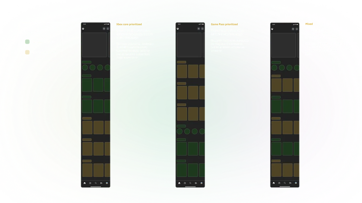
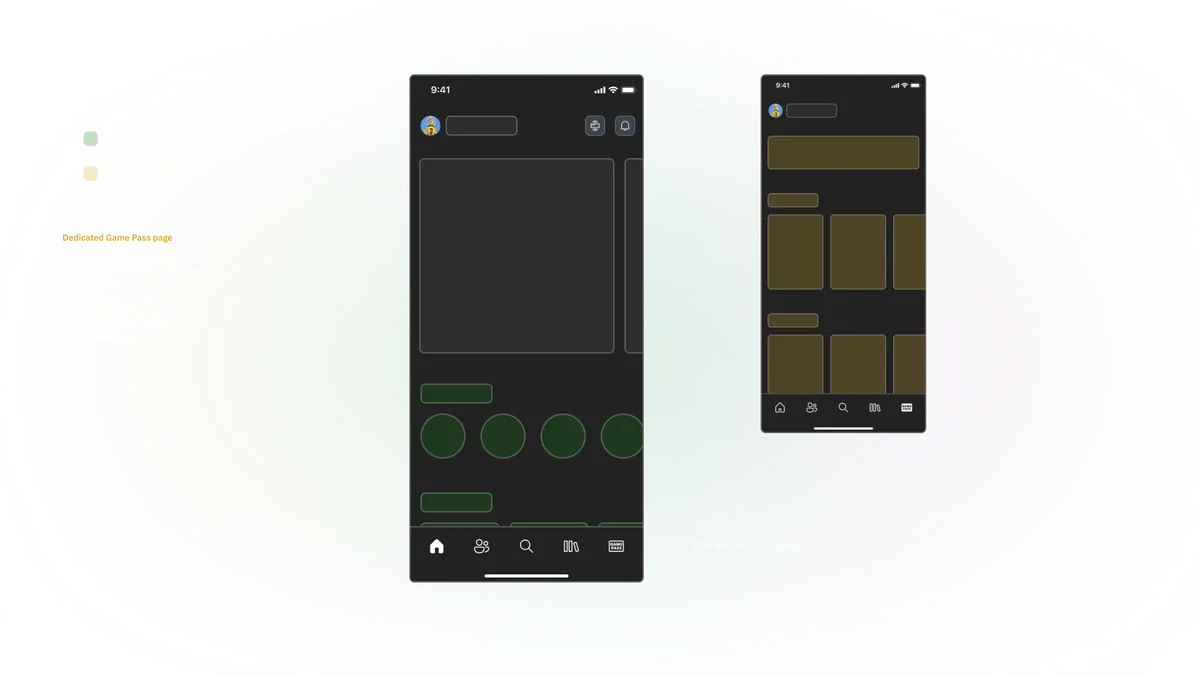
From there, I looked at patterns already working elsewhere in the Xbox ecosystem, along with common mobile conventions around how apps handle account and profile-level navigation, to see if a better answer already existed.
Solution
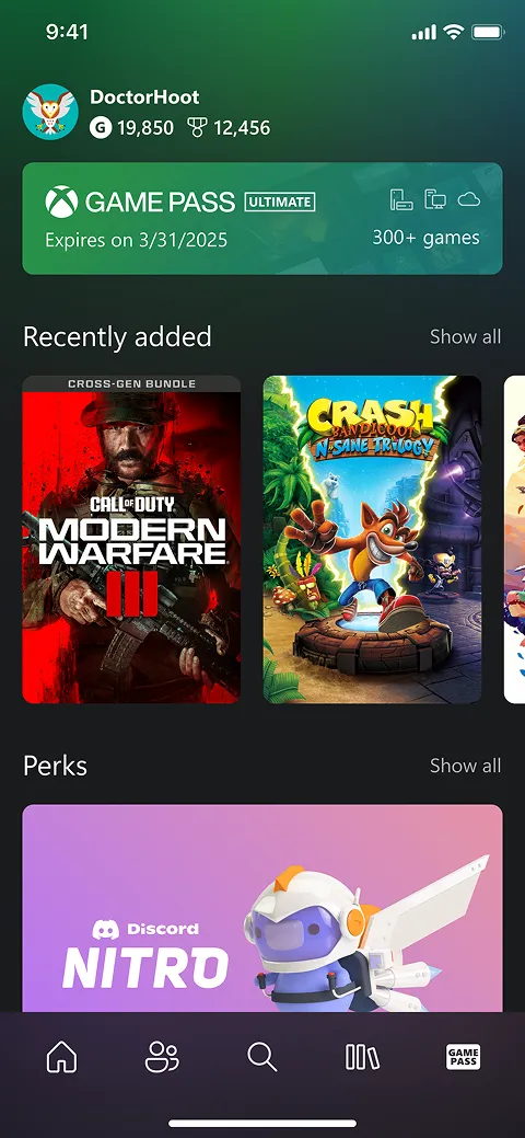
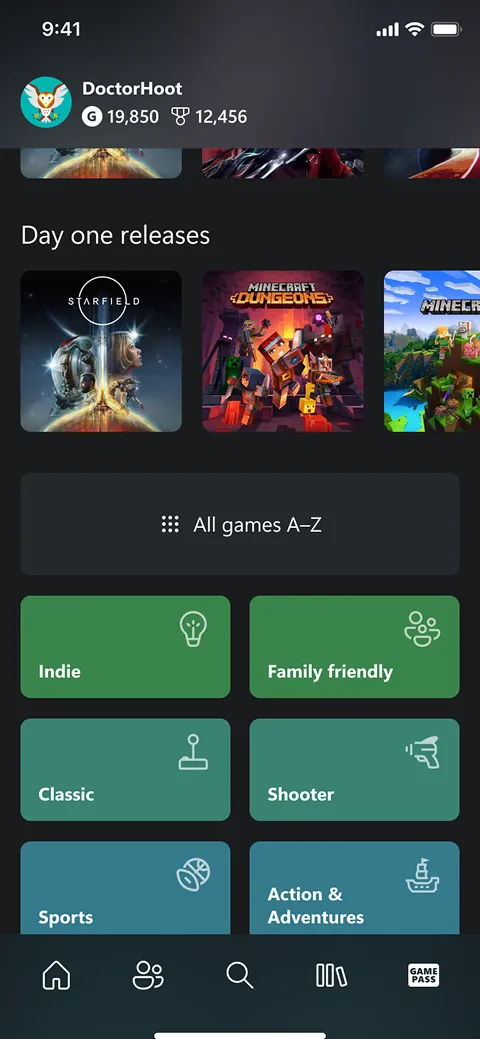
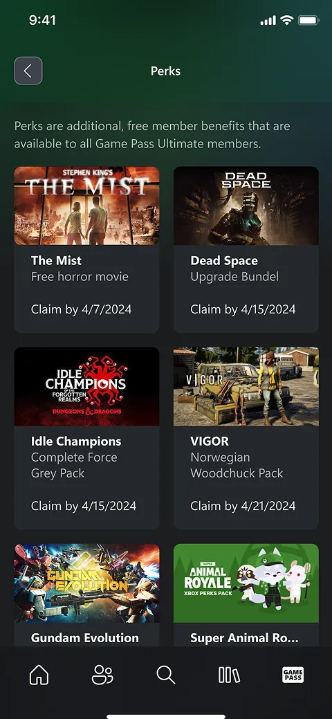
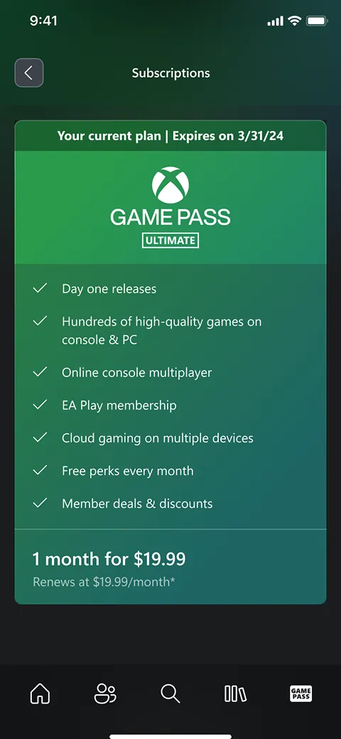
The answer came from an underused piece of the interface: the profile entry point. By adopting a pattern already established on other Xbox surfaces, we freed up dedicated real estate specifically for the subscription experience, rather than folding it into existing navigation and forcing a prioritization call.
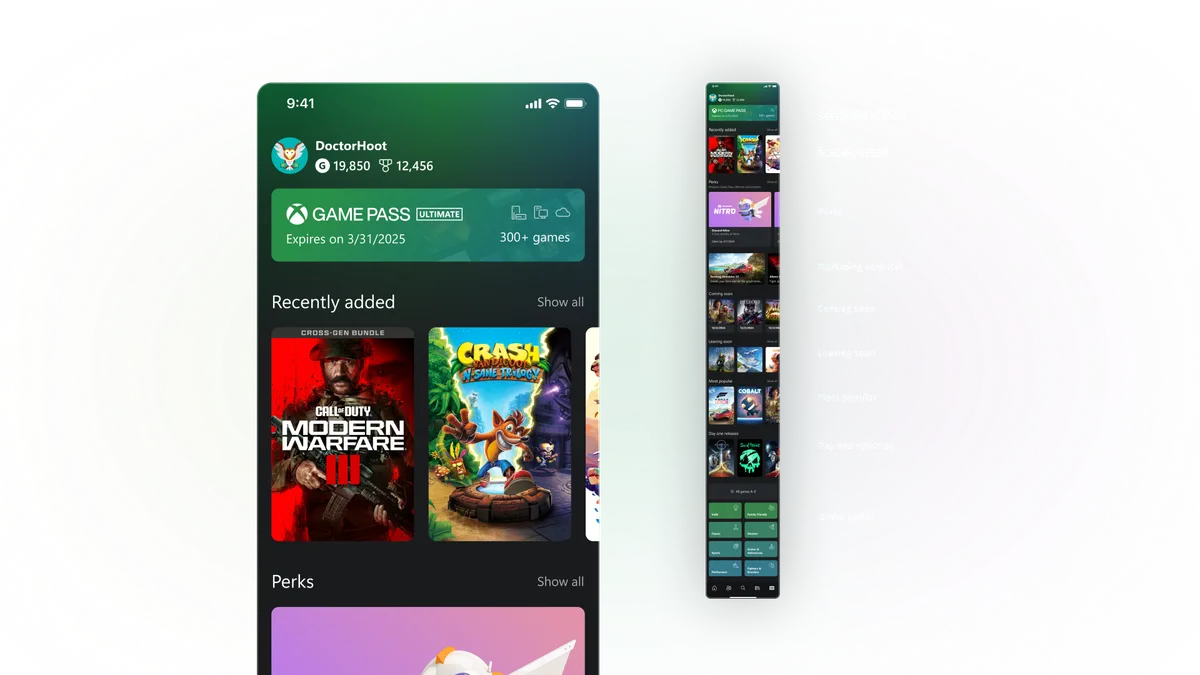
That turned out to be more than a structural fix. The subscription catalog had previously been somewhat downplayed inside the flagship app, since a dedicated app already existed for it elsewhere. Giving it a real, dedicated space inside the primary app let the team actively promote it for the first time, turning what could have been a defensive merge into an opportunity to drive new subscription discovery among users who'd never had a reason to find it before.
Opportunity
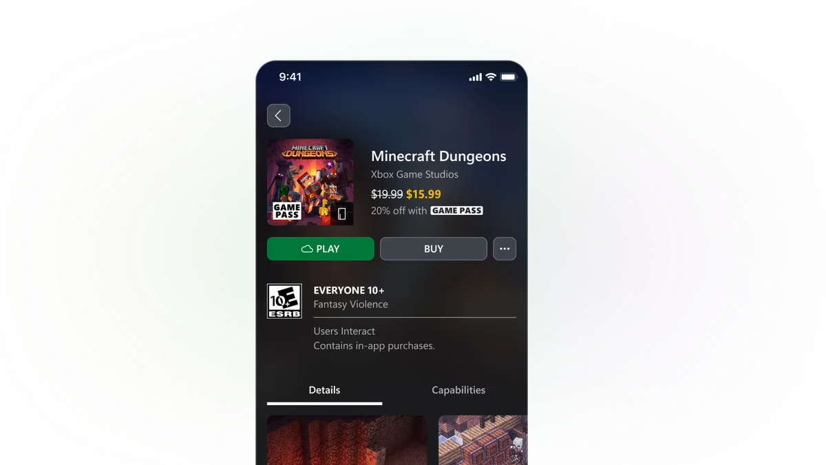
Consolidating the two apps did more than simplify the product. It also cleared the way for something the fragmented version could never have delivered quickly: commerce.
In-app purchases had been absent from the mobile experience for some time, a casualty of prior App Store policy. When industry-wide changes to those policies opened the door again, leadership saw the opportunity and asked whether the team could have a commerce experience ready to go the moment it was allowed. Because the app was already unified, one codebase, one team, one experience, the team could design and build it ahead of time rather than untangling which of two separate apps would even own the feature.
Takeaway
Consolidation projects are often framed purely as cost-saving or cleanup work. This one was, but it also created the conditions for something better: a simpler, more coherent product that was ready to capture an opportunity the fragmented version of the app never could have moved fast enough to take.